Frontier Communications


OVERVIEW
Frontier Communications is continuously growing their product relationships with different brands. They’ve Partnered with eero and Alexa to create voice assistant commands available to their broadband customers. Using a voice command (with an Alexa device) Frontier customers can pause internet control within their household. The plan is to roll out deliverables in phases as commands are introduced.
ROLE & RESPONSIBILITIES
UX Researcher, UX Designer, UI Designer
Tools Used : Figma, Asana, UserTesting.com
August 2022 - September 2022
PROBLEM
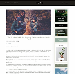
Technology has been advancing at an unbelievable pace since the late 1990s. Its impressive proliferation of engaging content, immediate connection to people almost anywhere in the world, and facilitation of unprecedented productivity offer invaluable benefits but important risks as well.
For parents, technology's most obvious impairment is how it interrupts family bonding time. Studies show that over 60% of children and teenagers bring some for of electronic with them to the dinner table.
With Alexa Dinnertime, parents and families are now empowered to pause the wifi which will allow their kids to focus on their meals and bond with their family.


GOAL
Have a landing page that speaks to the partnership, and the commands that are available to customers. Also explaining how they work, and how to enable them.
Have new landing page link to the eero product page so that users can purchase eero packages.
RESEARCH
To begin, I decided to benchmark several brands to find out if any of them have a similar voice command feature for their products. I not only wanted to know how they marketed the feature but what components stood out on each site.
Some other key questions I wanted to answer:
* What do each of these brands have in common?
* How are they formatting their information architecture?
* What are my competitors up to?
* Do they have any competitive advantages?
12 COMPETITOR SITES

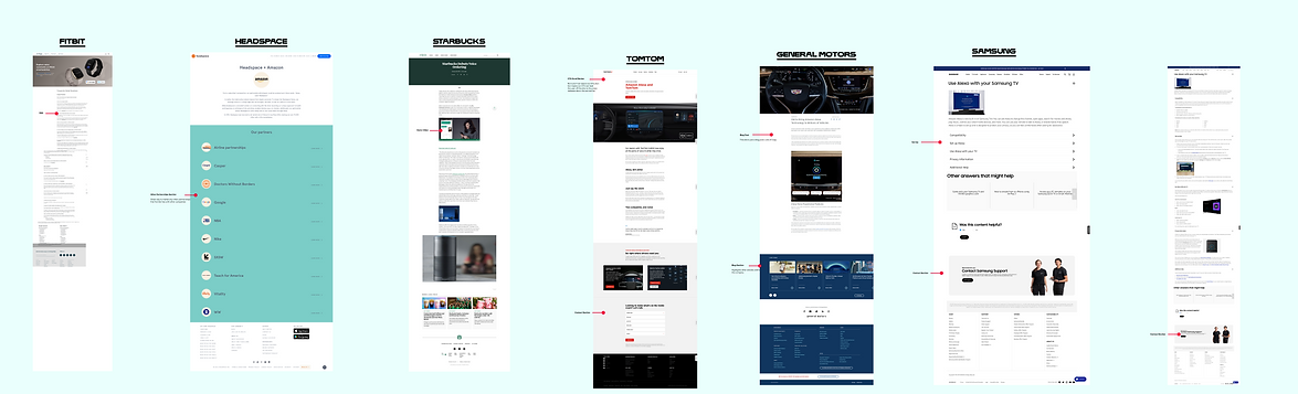
1. Ford
2. Mobiquirt
3. BMW
4. Comcast
5. Together 1
6. Home Connect
7. Fitbit
8. Headspace
9. Starbucks
10. TOMTOM
11. General Motors
12. Samsung
Key Takeaways
* 10 out of the 12 sites have a voice command feature for their product
* 5 sites have a FAQ Section
* 4 sites have some sort of a set up voice command section for users
* 6 sites have a demo video component
* 2 pages have a blog section
* 6 sites had a "how to set up" component

UNDERSTANDING THE USERS
After compiling and analyzing data, the user persona's of Jessica and Frank Curry was created.
Frank and Jessica are the parents of Addie, Jacob and Lynn. They recently moved from Ohio to Rochester, New York for Jessica's new job promotion.As a family they are getting adjusted to the new environment so family quality time is very important to them. Both Frank and Jessica understand the importance of being involved in their children's life during the change of environment and while they are very young

THE GAME PLAN
As identified above it is important for me to address the issues that Frank and Jessica are having at home. This new design needs to accurately explain what Frontier Dinner time is and how it works. It also needs to highlight the partnership between Frontier and Eero and stay in compliant with the design system
SKETCHED & LO-FI WIREFRAMES
Reviews, step by step set up, reviews, customer service cta, are the features that were incorporated in each of the team sketches.


STYLE GUIDE
The company recently went through a new digital rebrand and as a result, Frontier aims to design each of their digital products with a vibrant and electric personality while keeping a sleek and lively aesthetic. The colors are bright and energetic.


HI-FI WIREFRAMES
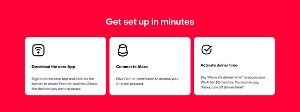
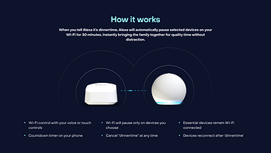
Phase one wireframe: highlights Alexa dinnertime voice command, quick and easy setup and partnership between frontier and eero.
Version 1

Version 2

Version 1 and 2 slightly differ. Version 1 has a component that highlights the different fiber/eero packages and version 2 has a component that highlights the frontier & eero partnership.
Hero component

Component highlighting what Alexa dinertime does

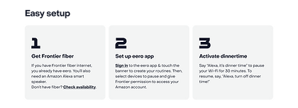
Quick and easy steps
STAKEHOLDER FEEDBACK
I presented the new design to several stakeholders within Frontier. It was important for the design to be seen by the marketing,
legal, copy, and brand department. This is personally my favorite part about being a UX Designer. Getting my designs In front of my team members and getting their honest feedback makes me a stronger designer.

UPDATED DESIGN WITH STAKEHOLDER FEEDBACK
After presenting the design to all the key stakeholders I was given the feedback that the page feels more like a product page and less like an informational page. I was asked to re-design it so that it is more of an informational page.


USER TESTING
Once the design was complete the next step was to launch a user test on the page to see how different users will perceive the page. My goal was that over half of the users that review the design understand the purpose of the page.
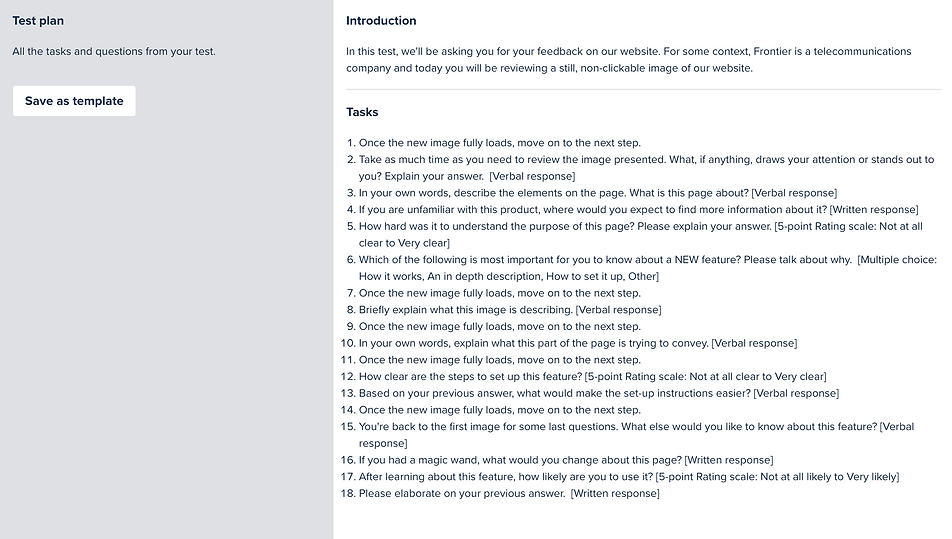
I performed this user test on usertesting.com. Below is the user test outline and the questions that each user was asked.

FEEDBACK
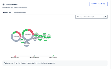
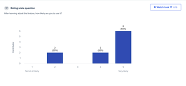
I was very pleased to receive great results. The majority of the users felt like the page was easy to understand, they were able to explain the meaning of each component and felt that they would use Alexa Dinnertime for their children if they could. Both the stakeholders and users were happy with the designs.


IN THE FUTURE
In the future I will measure the success of the page by tracking key metrics such as user engagement, retention rates, and overall satisfaction.
I will design the next phases of the Alexa/Frontier partnership. The next two voice commands to roll out are Alexa Study time and Bedtime.